


As a creative person myself, I know all too well how many drafts you have to go through to get to the finished result. One of my favourite things to see in the world of gaming is the 'nearly were' or 'almost could have been's; it's one of my favourite parts of books like Hyrule Historia that show all of the islands and character designs that didn't make the cut.
One of my articles that springs to mind here is Nintendo naming Donkey Kong and some of the names they came up with in the process. The fact that we could have been playing 'Kong Dong Bananza' doesn't escape me, and I'm just thankful that they came up with DK's iconic name so that never had to be a reality. And while the PS1 logo is one of the most iconic and instantly recognisable gaming logos of all time, some of the designs that Manabu Sakamoto came up with in the process are pretty wild!
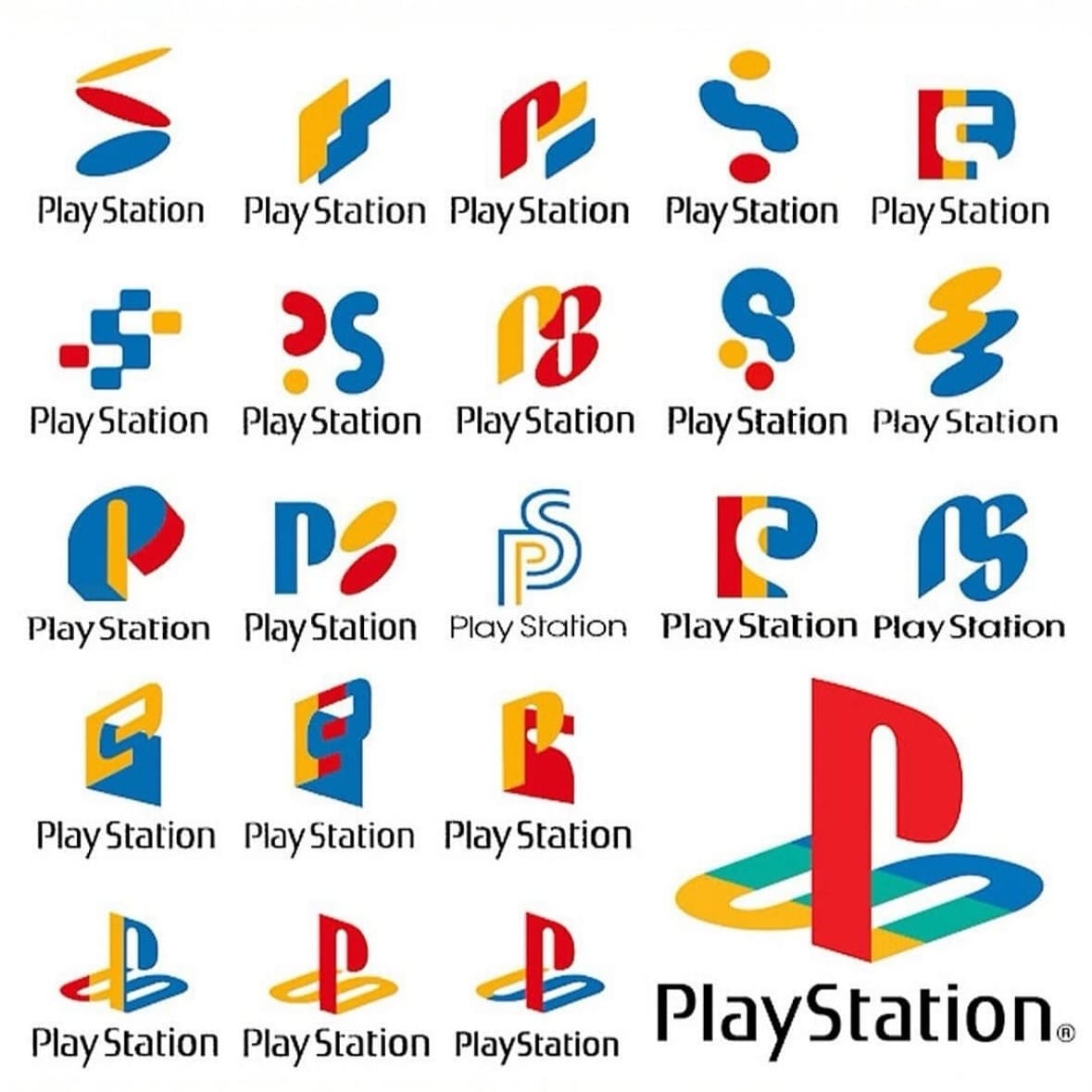
The 'falling coin' image in the top left of the ideas has a definite SNES feel to it, and it's nice to see the evolution of Sakamoto's ideas as he worked through the creative process. I wonder what was going through his mind when he came up with the question mark and blue S logo on the second row!
The iconic logo that we all know and love brought depth and intrigue at a time when 3D gaming was finding its feet, and it symbolises the influential role Sony played in pushing the boundaries of gaming through the 90s.
Would they have been as successful with any of these other logos? Which one is your favourite? Let us know in the comments below!


