Pokemon is a franchise that runs purely on creativity; if the creative juices in the artists at Pokemon runs out, the Pokemon brand will start to deteriorate and so will the Pokemon designs.
So it is a known fact that the Pokemon company takes the design of the new Pokemon very seriously. But sometimes, some designs make it to the final product which just looks awful, but for a reason.
Many in the Pokemon community like to categorise Pokemon based on their powers, types, colours, styles, inspiration, etc. One such category can be for Pokemon that have a horrible design, ugly Pokemon, if you will.
These are the Pokemon you would never like to have at your party.
Not that they have bad powers; in fact, some of the worst-designed Pokemon have good enough abilities to go toe to toe with legendaries. Still, their design is something that you just can’t overlook.
So we decided to make a list of the ugliest Pokemon based on personal preference. Each design is great, we don’t want to take away from that, but come on… some on this list are just damn ugly creatures, which you could associate with superb design skill.
So let’s take a look at the ugliest Pokemon!
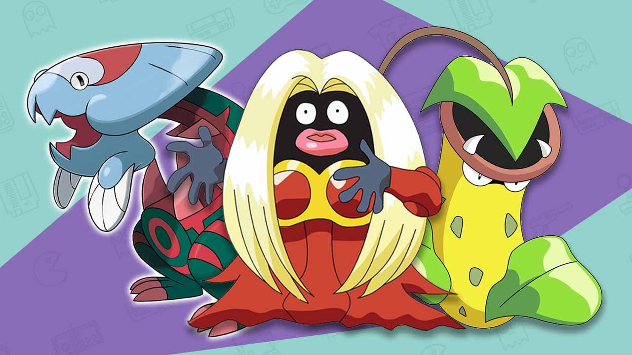
10. Victreebell
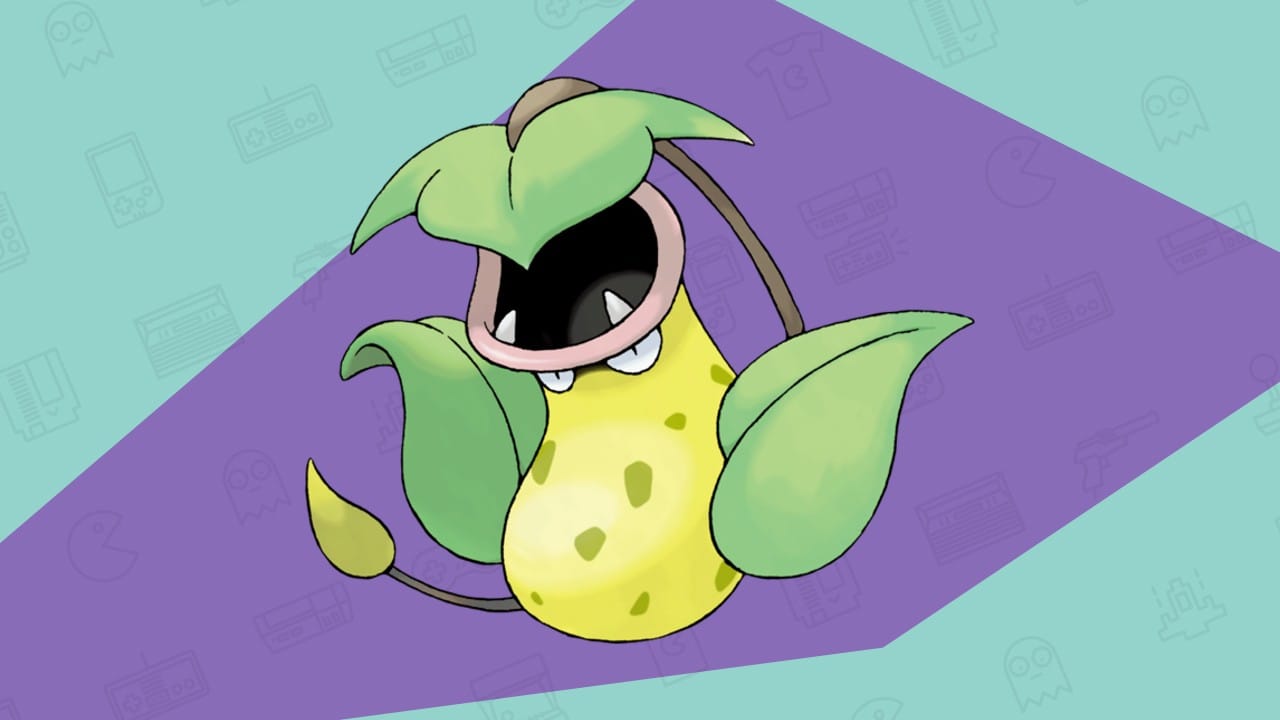
The moment I saw this Pokemon in the anime TV series I decided never to use grass-type Pokemon ever again, it was that dang ugly.
The design for Victreebell is awful; it looks like a water jug with some leaves stuck in it instead of handles and if that wasn’t enough, the Pokemon literally eats smaller Pokemon and dissolves them with acid inside of its body.
Then uses the same acid to attract even more Pokemon, using its fangs to push them into the well of despair.
There’s a reason why this Pokemon was made a part of Team Rocket; it is evil and ugly and why it’s the bad guy in many of the best Pokemon fan games.
9. Omastar
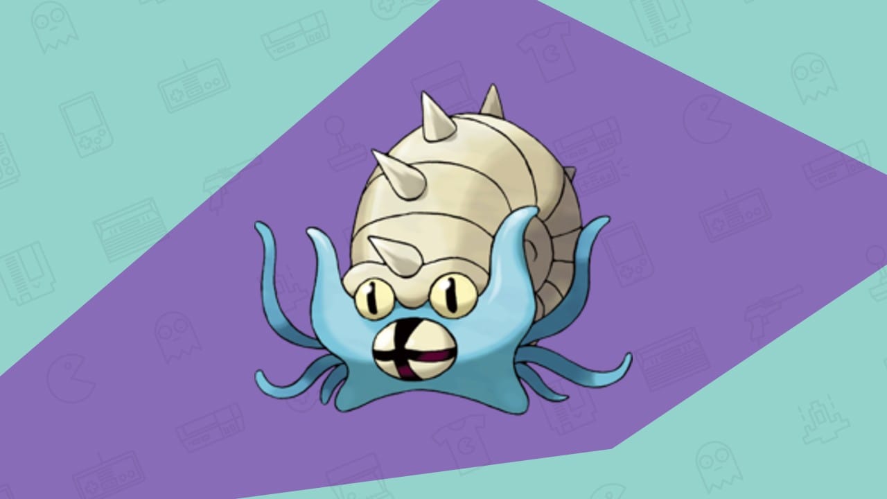
Where do I even start with Omastar? It has the worst design when it comes to Pokemon based on aquatic animals, even though many deem it as “cute”.
Its shell and body are used as a defence mechanism.
There’s nothing wrong there, but the moment you look into its threatening eyes you just know that it’s going to be an angry ugly Pokemon.
I mean, the Pokemon literally went extinct because it was not able to carry the load of its own shell and hence wasn’t able to catch its prey. It literally starved to death in a world inhabited by millions of creatures!
I know that has nothing to do with why this is one of the ugliest Pokemon, but I just had to mention that!
8. Natu
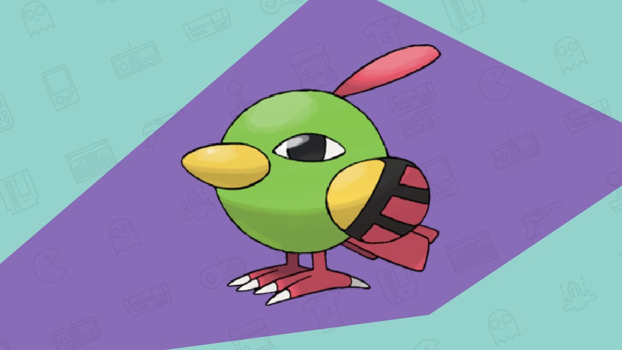
Natu looks like the doodle that young children make when they attempt to draw an overweight bird; there is no form factor to this parrot-like bird in Pokemon and if anything, it’s probably the worst aerodynamic bird i’ve ever seen.
Its face is its entire body, and for some reason its eyes are so thin and large; the front view of this bird is enough to give you the chills; that is how bad it looks in the game.
Natu’s color scheme isn’t anything to be cherished either; the green and red color make it look like a watermelon in the jungle.
Its wing has a yellow tint, which adds some color apart from the red and green. But these wings are literally useless; Natu can’t even fly.
So its wings are pretty much meaningless and because of all that and the way it haunts our nightmares is why its in this ugliest Pokemon list.
7. Lileep
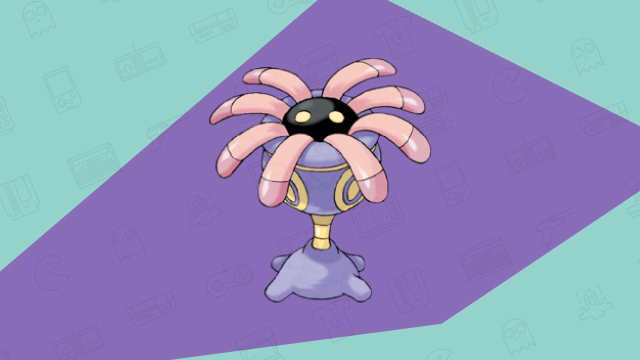
Next up, we have a Pokemon that looks like a flower but isn’t one. It looks like an octopus, but isn’t one, that looks like a tree, but isn’t one; I’m obviously talking about the abomination that is Lileep.
I don’t see what the designer thought when he was creating a Lileep; the Pokemon doesn’t even look like a Pokemon; it looks like an inanimate object that you see lying around the beach.
Are the eyes on the top of the head, or is its eyes on the chest?
Who knows, but my burning desire to boot it across the beach grows every time I see it. For me, this ugly Pokemon is on the list because of the little innovation gone into its design.
6. Binacle
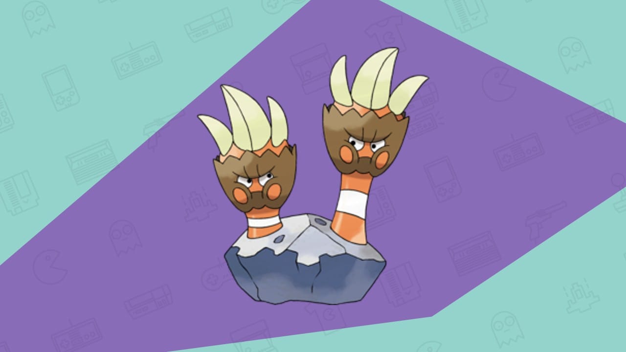
The first time I saw Binnacle’s design, I was laughing like crazy; I just didn’t understand how something like this even go through the creators’ watch and make it into the franchise.
I know the Pokemon is supposed to be based on a not-so-interesting creature (goose barnacles), but they could’ve done a much better job.
Binacle just looks like two hands sticking out of a rock, pissed at one another like a couple that have been together for 40 years.
Still as of writing this, I have no idea what it’s meant to be.
5. Bruxish
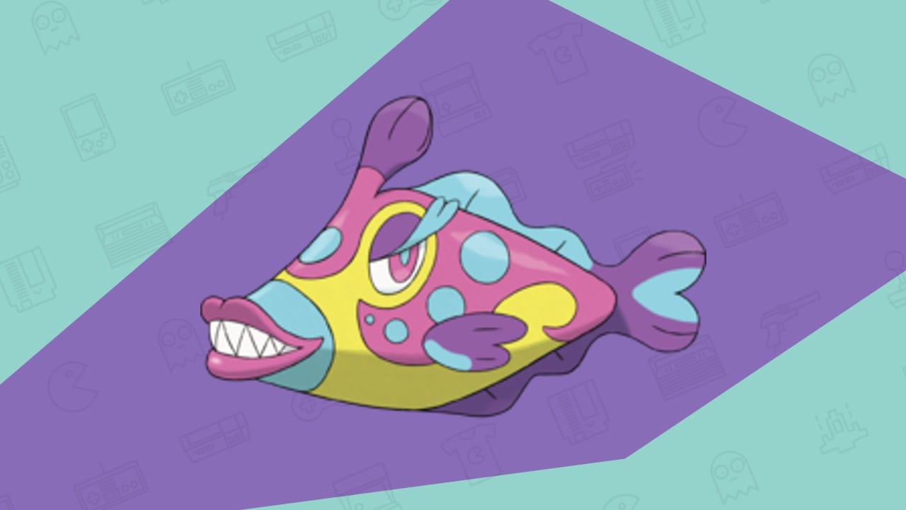
Bruxish is an inhabitant of the Alola region, which houses a lot of water Pokemon, primarily Pokemon that look like fish.
But calling Bruxish a Pokemon inspired by fish will be an insult to fish all around the globe; that’s how ugly it is.
I get the name, Bruxish, it plays on the term Bruxism (tendency to grind your teeth), but that doesn’t mean you’ll give it teeth that look like a demon or the lips of a barbie!
And why does it have huge eyelashes? Is Gamefreak trying to make it look seductive or something?
That adds even more weirdness to this already weird Pokemon. And if its features weren’t bad enough, the artist added the most outrageous colour combination to this little fish. Blue, Yellow, Pink and Purple, where do I look first?
4. Flapple
I used to think Dragon-type Pokemon were the coolest, as I hadn’t seen a single lousy dragon-type Pokemon design. Almost every dragon-type was a fan favourite in every generation, and rightfully so, they’re literally dragons; who doesn’t love dragons!
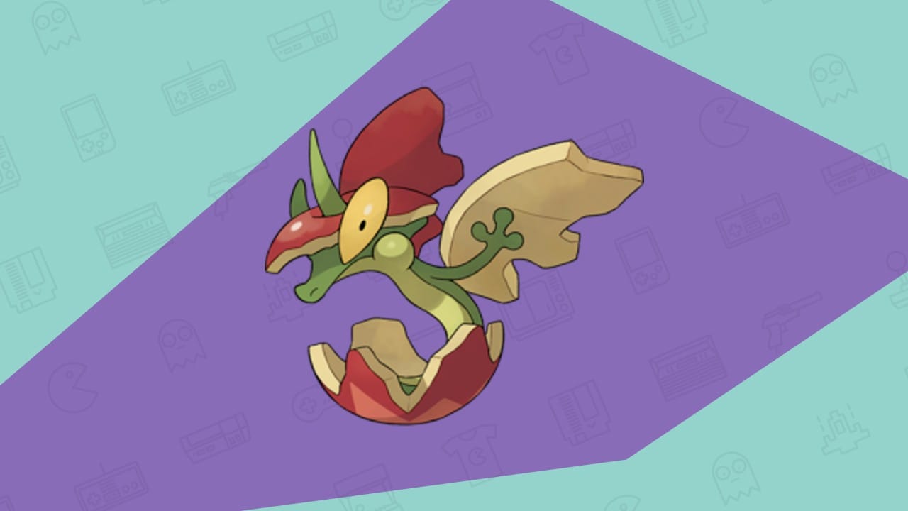
But then I stumbled upon this Grass/Dragon type from the eighth generation games, and my outlook changed totally, some would argue that this isn’t ugly and in fact cute, which we are more than happy to agree with, but imagine if this Pokemon turned up in real life? Ugly.
A dragon, which takes design elements from an apple? A dragon should be based on a legendary monster from folk tales around the world, not an apple.
An apple a day might keep the doctor away, but in this case, I’d instead go to a doctor than be anywhere near this creature. It is the final form of Applin, which looks like an apple; in its final form, it just grows taller and has the same apple above and below its body.
And hear this out, it uses this apple to hide in the wild by closing the upper and lower parts. Next up, we’ll get a banana-inspired Dragon that peels its skin back up to hide in the wild; c’mon Gamefreak, you can do better!
3. Dracovish
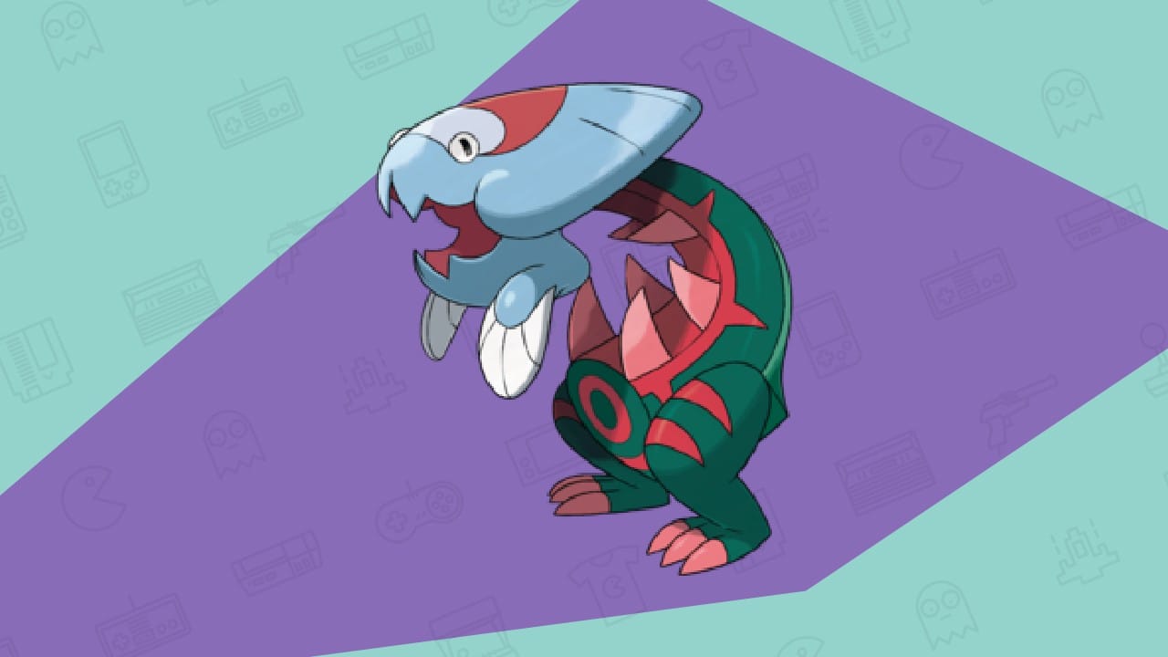
The eight-generation really took my love for dragons and threw it into the deepest corners where I’ll never be able to find it again, you can check out all Pokemon games in order if you’re getting confused about what gen is what!
Another Dragon-type Pokemon which was ruined, is a fossil dragon type that had so much potential, and Gamefreak came up with this…
It looks like a big creature took a bite out of its stomach and left it to pass.
It genuinely looks like a person wearing a costume; just look at its head, it doesn’t belong to that green body, and I know it’s intentional but still, the designers did a real good job at making this thing look ugly!
This hands down one of the ugliest Pokemon out of the bunch.
2. Probopass
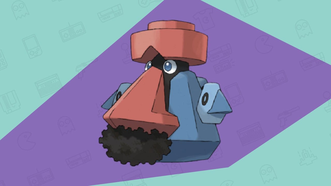
I remember playing in the Hoenn region, catching wild pokemon on a blissful day when I was encountered by Nosepass, a Pokemon so weird in its design that I had to go on the internet to check if I had stumbled upon an easter egg or someone had added this Pokemon on purpose just to mess with me.
It looked more like a Mario villain than a Pokemon to me.
Imagine taking that Pokemon and then giving it an even worse evolved form. Probopass takes what made nose pass so bad and multiplied it by 100, leaving us this abomination of a Pokemon that I can’t help but have nightmares about.
It has human-like eyes, a nose, and iron fillings that resemble a mustache. But I didn’t see a mustache at first; I thought it was its nose hair…
That’s why I always “pass” when a Probopass appears in the game. Would you class this as one of the ugliest Pokemon in the game?
1. Jynx
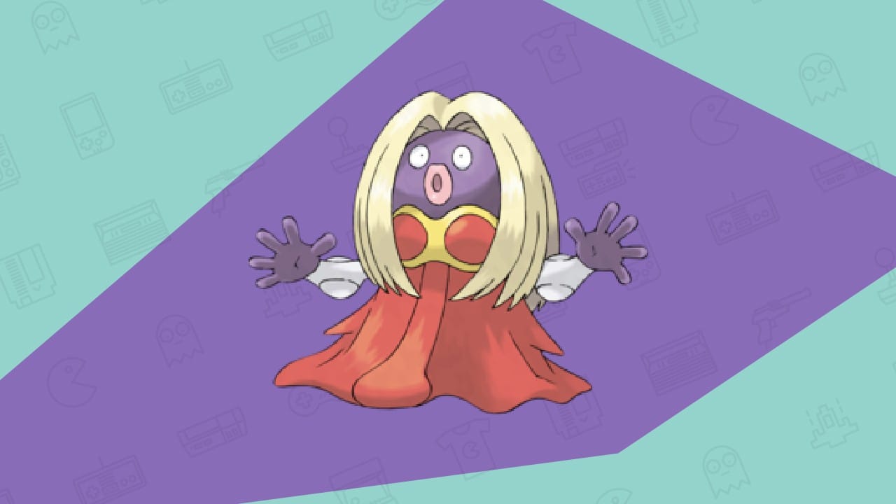
You were completely wrong if you thought we’d put any Pokemon other than Jynx at the number one spot for this ugliest Pokemon list.
Jynx is a Pokemon that has been the most consistent; it has consistently ranked number one on such lists, no matter who creates it, and rightfully so.
Why is a Pokemon trying to look like a human woman? It creeps me out real bad, and it’s why many of the best Pokemon ROM hacks uses her as an evil Pokemon
I still remember when Jynx appeared in the anime. It scared me; the emotionless face combined with those weirdly big lips and blond hair is a recipe for disaster, like Nicki Minaj jumped straight into the animated TV show.
And if that wasn’t enough, many accuse Pokemon of basing this Pokemon on the cartoons that had blackfaces on them, making Pokemon fans rage with anger many years ago. Others think it represents the drag queen culture; either way, the Pokemon is not the prettiest.

